


Cologne
2018
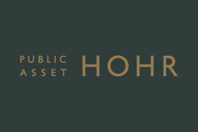
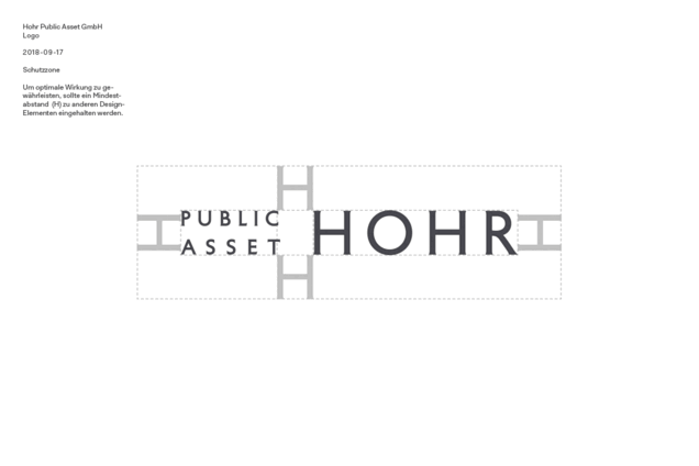
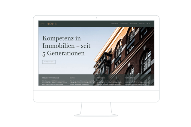
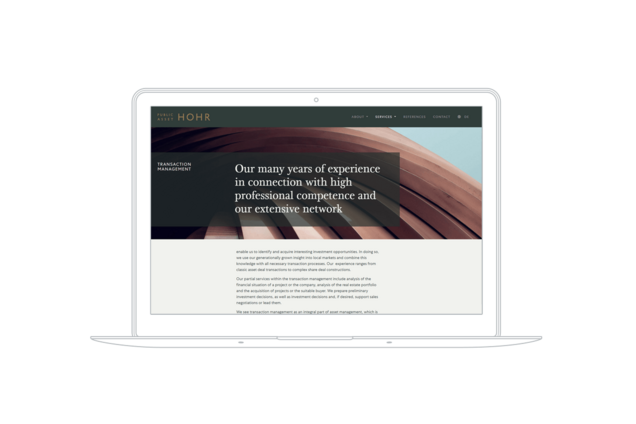
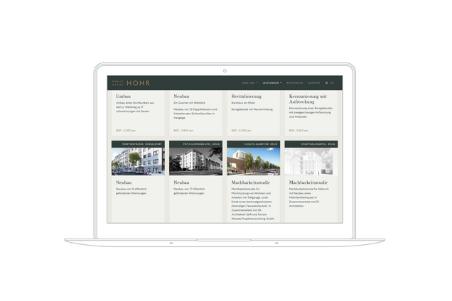
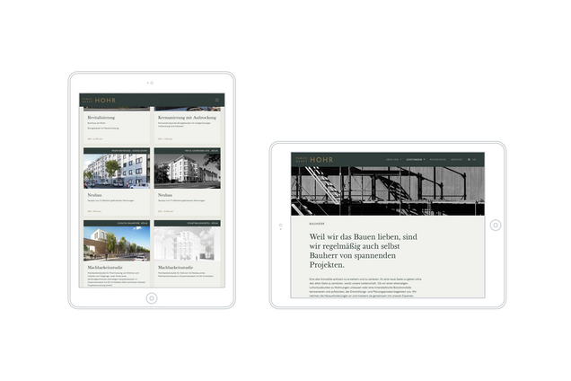
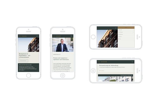
The old website was no longer up to date and the appearance was to be rethought as part of the merger of corporate divisions. Under these conditions, we developed a new corporate design and a mobile, bilingual TYPO3 website for the Cologne real estate agency Hohr Public Asset. Based on the colour ›British Racing Green‹, we defined a palette of corporate colours, designed a new logotype and defined suitable fonts.
Within Hohr Public Asset's visual identity, the choice of the right fonts is particularly important. The logo uses a modified version of the font ›Petit Serif‹. This typeface, developed by designer Matthieu Cortat, is based on a monumental Roman Capitalis designed by Percy J. Delf Smith–to be seen in London at Building 55 Broadway. It harmoniously complements the colour world based on entrepreneurial personality and corporate identity. Another font by Cortat is used for the headlines: Based on classic 18th century fonts, ›Bonesana‹ is a contemporary interpretation that does not interpret humanism and universalism as opposites. The body copy font ›Centra‹, a modern, geometric sans by designer Josh Finklea, follows a similar approach and interprets Bauhaus aesthetics in a legible way.
The website conveys the company's services in two languages, shows how the company works, its aspirations and its portfolio. We supported the optimisation of the texts for the website, developed a suitable visual language and formulated a close alliance between understatement, classic aesthetics and contemporary technology.
With Carolin Deckers / DK Architekten
Photos: Hohr Public Asset, unsplash.com
Rendering: Budzinski & Pächthold GbR
Translation: Corinne Klarmann


back-to-top